Almond Fintech
Pioneering in the East: Introducing credit scoring to multiple populations with technology
WHAT IS ALMOND FINTECH?
Almond is an international funds network using blockchain technology that connects people and financial institutions everywhere around the globe.
Collaborators
Amanada Rheade - Project Manager
Diego Martinez - UX/UI Designer
Nicole Levy - UX/UI Designer
Ezekiel Gavieres - UX/UI Designer
Project Summary
Timeline: 5 months
Deliverables: Functional Prototype of MVP
(Minimum Viable Product)Tools: Figma, Clickup, Slack, Google Meets
Target Device: Web (Desktop and Android),
Mobile App (Offline capabilities)
My Role
UX/UI Designer
Satisfied all of the clients’ and stakeholders’
feature requests120% Client Satisfaction

Taking Notes
We, as part of the credit team, were tasked with building a responsive web application that allows loan agents to interview potential candidates for small business loans.
I asked questions to fully understand the use cases and the audiences the app was created for, and I listed all of the specifications that were needed for a complete experience.
Working in an AGILE environment, I was tasked with creating the Assessment Experience.
WHO ARE THE USERS?
This audience has several users:

The Agent

The Admin

The Customer
The experiences for each user are unique, following three different access levels. Admins have full access, including repositories of information, while agents only have access to the customer database, where they can create profiles for customers. On the customer’s level, they can only access the questionnaire experience that is isolated from the rest of the application to mitigate risk
and prying eyes.


Creating A Clear Path
I created a high-level flow chart to touch every single base for all audiences, and the team created flow charts for all the other sections.
This allowed us to fully understand all of the steps to go through from start to finish.
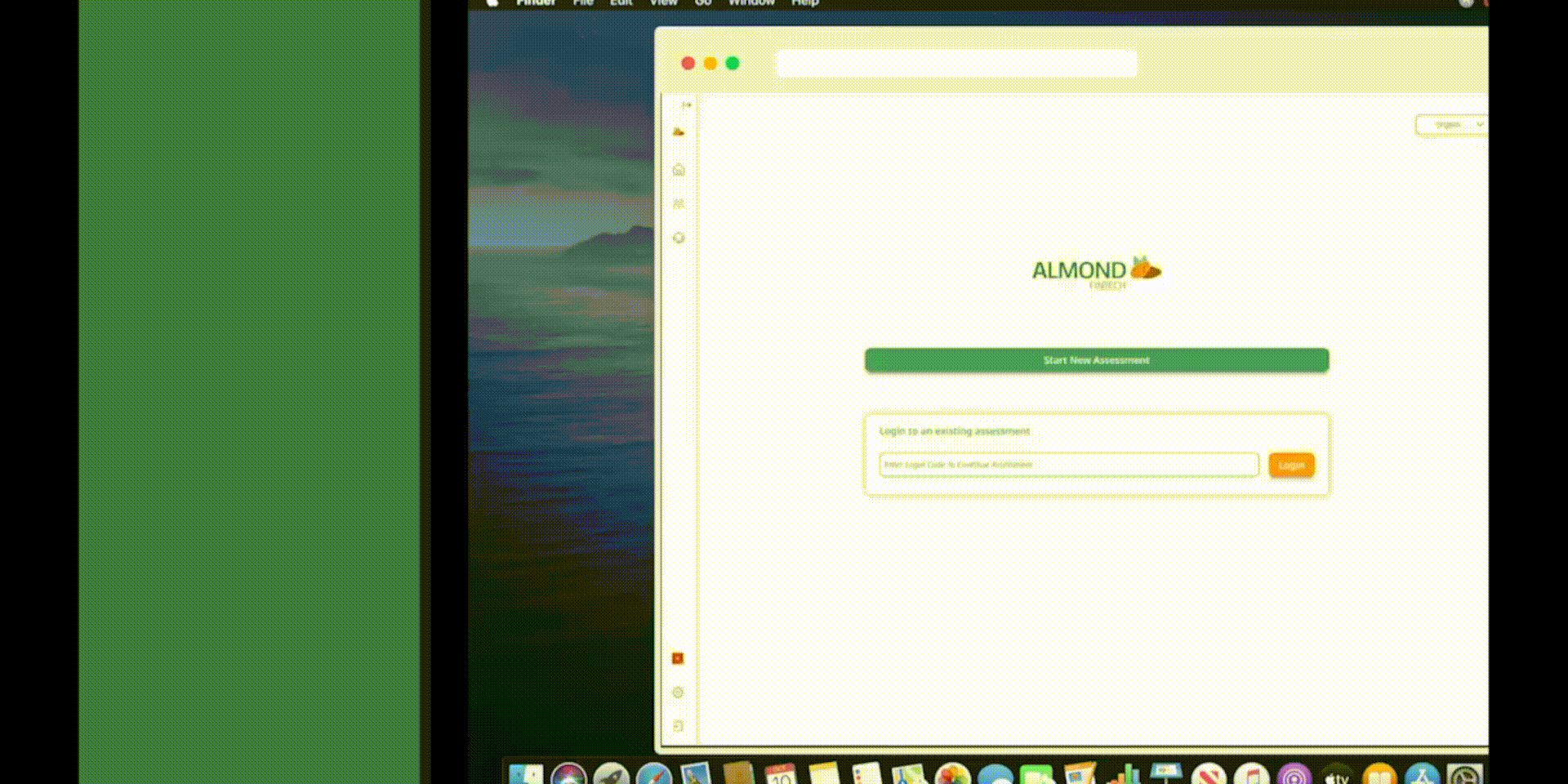
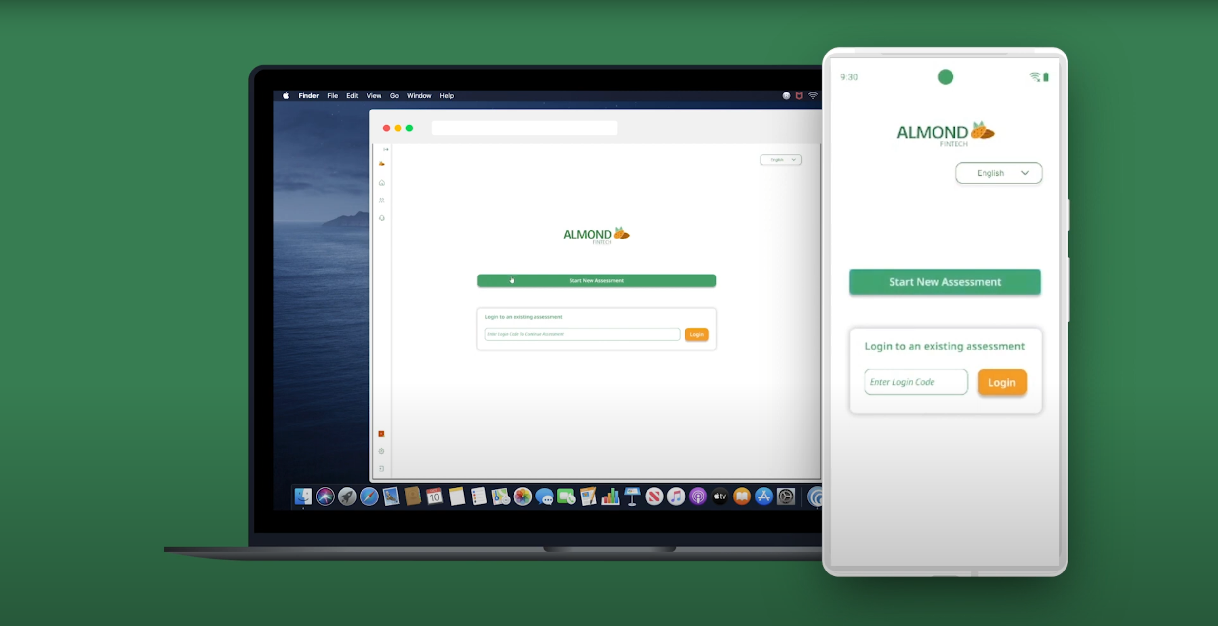
RESPONSIVE WEB APP
SKETCHES TO PROTOTYPE
Almond had an existing design guide for components, and I updated them accordingly while building our new ones. I also included some interactions in the live prototype to show that experiences like these can be engaging for audiences.
Desktop
With these, we were able to sketch out appropriate wireframes, making sure that functions were in place.
Desktop Examples
Iteration
Mobile
Making sure that the designs were easily transferrable to mobile, I sketched the mobile version to show the same components.
Mobile Examples
Prototyping
DISCOVERY AND EVOLUTION
Almond is a startup. Like all startups, the business is always learning at an exponential rate while being developed.
While the research team was traveling in Asia, interviewing the audience, it was discovered that not all institutions had readily available or reliable internet. Most of the rural towns in developing countries lacked the technology and in some instances, literacy. Learning this, we simplified the copywriting to make it universally accessible, accounting for hundreds of languages in the APAC time zones, and made sure the web app was translatable to a downloadable application. This ensured that clients in those recently discovered regions could download and use the app locally and easily.
The reason we wanted the mobile application to be a 1 to 1 experience is so that agents and admins can use multiple devices interchangeably without needing to relearn the whole experience.
ENGAGING INTERACTIONS
Hover States
Interactions aren’t just about fancy animations. Effective interaction designs hit on multiple points to enhance the user’s experience.
In Almond’s case, I designed a hover state that uses Almond’s company colors, reinforcing the brand and accessibility by visually aiding users while selecting multiple assessment answers. This assists users with heuristical decision-making, eliminating uncertainty and doubt.
Digital Declutter
Sometimes clutter is inevitable, especially if there’s tons of information displayed. Being able to collapse and expand the navigation menu allows for better visual tidiness as well as ease of use.
User Satisfaction
The research team has supplied a multitude of questions for incorporation into the assessment. Typically, surveys conclude without any supplementary feedback. However, in this assessment, our team has integrated informative content, utilizing a straightforward animation to provide insights into the performance of test-takers.


Stay tuned for more information!
Enjoy this product showcase!
Thank you for getting to the end! I hope
you learned something new about me and the project. I have other projects you can check out.
Contact me if you want to
collaborate together!